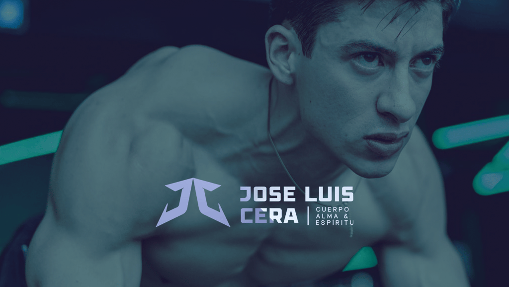
The Monogram Icon JC is constructed with geometric precision, forming an abstract symbol that suggests upward momentum and expansion—core concepts in fitness and personal transformation. The angular, arrow-like shapes point upward, visually communicating growth, progress, and elevation. The symmetrical design conveys balance and stability, essential qualities in both nutrition and training disciplines.
The bold, industrial sans-serif for JOSE LUIS CERA projects strength, confidence, and authority—exactly what clients seek in a fitness professional. The heavy letterforms suggest solidity and dependability, reinforcing trust in his expertise.
CUERPO, ALMA & ESPÍRITU
(Body, Soul & Spirit) establishes JL's holistic approach to wellness. The lighter weight typography creates visual hierarchy while communicating that his methodology transcends purely physical training—he addresses complete human wellness. This philosophical positioning differentiates him from trainers focused solely on aesthetics or weight loss.
The logo successfully communicates expertise, professionalism, and a comprehensive approach to human performance and wellbeing.