
Sergio Durazo
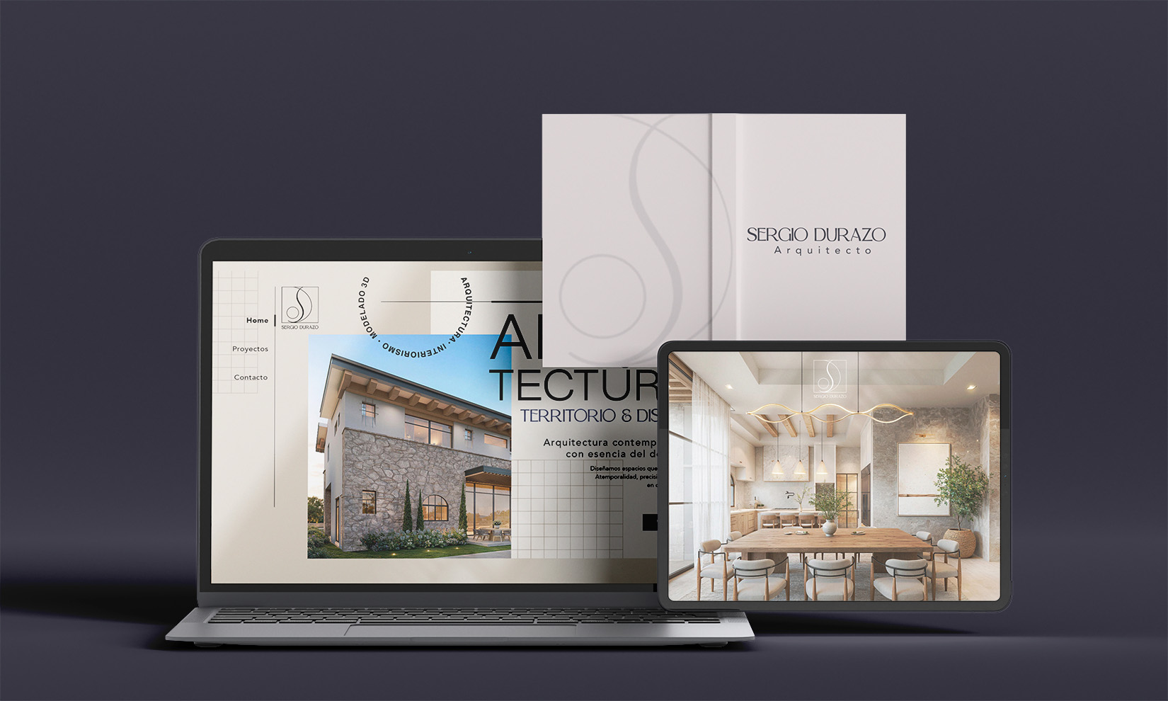
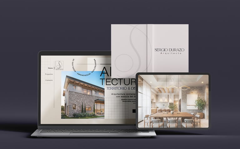
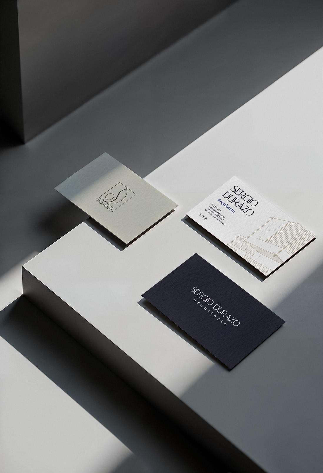
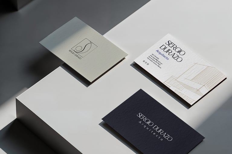
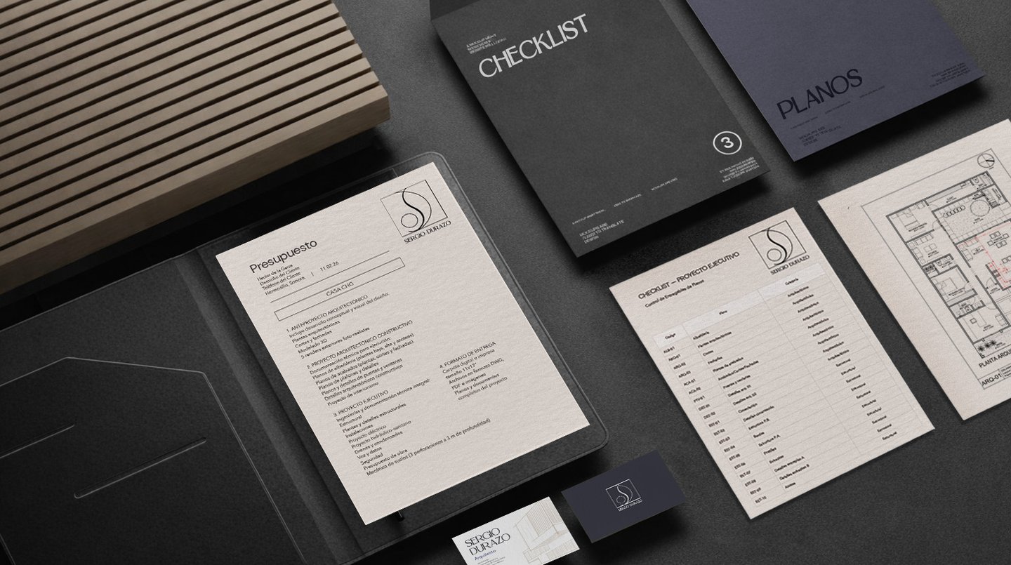
Brand identity design for Sergio Durazo Architect, focused on conveying a contemporary, refined, and functional aesthetic.
The project included logo creation, visual system development, and cohesive brand applications across stationery and digital platforms.
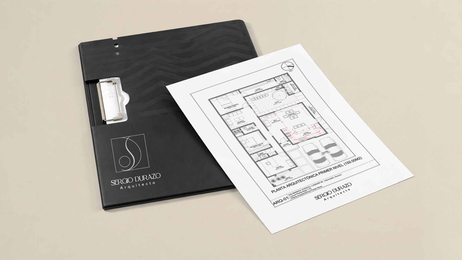
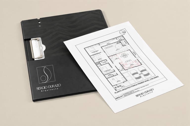
Mockups showcase the logo in real-world use, along with a website concept that reinforces a consistent and professional brand experience.


The logo is built from a synthesis of personal identity, regional context, and architectural language.
A square forms the base, representing stability, structure, and order—core principles of architecture. Within it, a curved line subtly shapes an “S”, introducing fluidity and movement, while a half-moon form suggests a “D”, creating balance between organic and geometric elements.
The circle acts as a versatile symbol: it references the Sonoran sun, while also functioning as an architectural element—readable as a point, a node, or a representation of natural elements within a design.
The result is a minimal yet meaningful identity, where every form serves both an aesthetic and conceptual purpose, reflecting precision, origin, and a contemporary architectural vision.